How to ensure your site is mobile-responsive?
The Website Builder and all existing themes available on Knorish have been carefully designed to ensure that your website is mobile-responsive. The platform automatically adjusts the elements and their content on a page according to the size of the device being used.
This means that irrespective of the device size - Mobile, laptop, tablet, or a large screen, you will be able to create a website that is mobile responsive.
Covered In This Article
- Best Practices To Ensure Your Site Is Responsive & What Not To Do
- How To Check If Your Site Is Mobile Responsive
Best Practices
In order to ensure that you create a responsive website there are 5 methods that you must adhere to. These 5 methods have been listed below for your reference
Responsive Images
Use responsive images that adjust their size based on the screen size of the device to ensure that images do not stretch or become distorted.

This means using contextual images which should not have text pasted on the images. The Text must be added on the section as a separate element.
When you use images that have text pasted on them, based on the different device sizes, the images can get cut leading to the text not being readable.
White Space (Negative Space) Usage
White space or negative space is the area between design elements. Ideally, 20% space on the left and right of the site page are left open for devices to not cut out elements from your website.
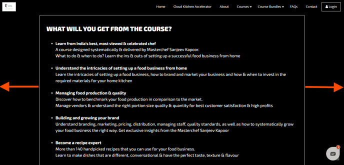
The image above shows the white space being left for this exact reason. This ensures the page is seen clearly across devices - big or small.
Relative Font Sizes
While fonts realign on the basis of the device in use, use relative font sizes to ensure that text is readable on all devices. Too large a font or too small can make the text non-readable.
Section & Text Placement
Break up larger text into smaller segments to create bite-sized content. You should also use a bullet-point-based structure for your content to ensure you have a higher readability of the text.
Similarly using alternate image-based sections can also help in breaking the monotony of the design and makes reading the page a lot easier.
Menu Setup

Ensure to arrange the menu on the website neatly to avoid any breaks in the view. Having too many menu categories can break the view on laptops or desktops of varying sizes.
This means not having too many options on the menu in the first category. Should you need to add multiple links in the menu, create categories under which subcategories can be listed.
Key menu categories that should be added
- About
- Courses
- FAQs
- Contact Us
- Login
💡 Important Note: On mobile devices, the menu automatically changes to a ☰ hamburger menu ensuring a clean menu view. No custom setup is required.
How To Check If Your Site Is Mobile Responsive
Inspect Method
Preview your website on different mobile devices by clicking
- Windows OS: F12 OR Windows – Control + Shift + C
- Apple: F12 OR Command+Option+i
Then Click on Dimensions on the top left of the screen to select the devices available in the list and check for mobile responsiveness.
Direct View On Device Method
Alternatively, you can also open your website on different devices & browsers to ensure that it is responsive. Elements that are not must be edited to ensure the site is responsive.