This article shows how a user can include a wide range of exciting sections, including background images and eye-catching slideshows to their site.
When designing your website on Knorish, you'll find plenty of section options. To add them, go to the EDIT mode of the page and select '+SECTION' at the bottom.
Details of each section type are shared below:
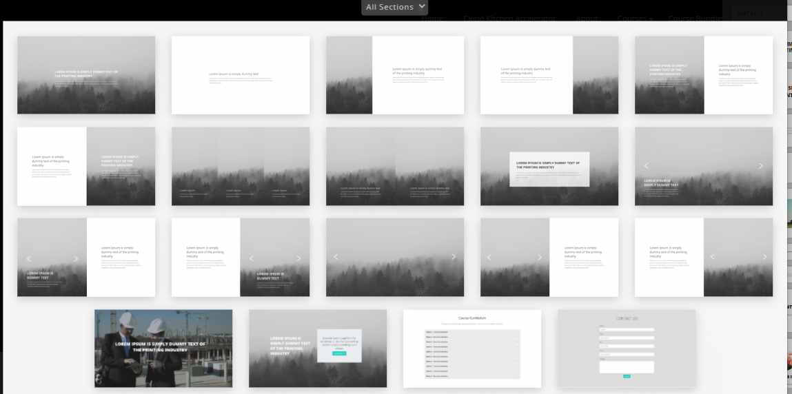
- Section 1: Background image and text on it
- Section 2: Plain background and text on it
- Section 3: Image on the left and plain background with text on the right
- Section 4: Image on the right and plain background with text on the left
- Section 5: Image and text on the left, plain background and text on the right
- Section 6: Plain background and text on the left and Image and text on the right
- Section 7: 3 divisions with background image and text on each image. Image dimensions 600*900px
- Section 8: Image and text on the left and on the right as well
- Section 9: Background Image with text inside a box
- Section 10: Slideshow with text
- Section 11: Slideshow with text on the left and plain background with text on the right
- Section 12: Plain background with text on the left and Slideshow with text on the right
- Section 13: Slideshow only (this section has no placeholder hence, a snippet cannot be added to this one)
- Section 14: Slideshow (no placeholder) on the left and plain background with text on the right
- Section 15: Plain background with text on the left and slideshow (with no placeholder) on the right
- Section 16: Background Video/Gif with text on it
- Section 17: Background image with text on the left and text inside a box on the right
- Section 18: Course Curriculum. Learn more here: https://knowledge.knorish.com/enable-automatic-course-curriculum-updates-on-course-pages
- Section 19: Contact Us form. Learn more here: https://knowledge.knorish.com/how-to-create-a-contact-us-form-and-check-for-queries-submitted-via-the-form
Important Considerations
- In order to ensure mobile responsiveness, banner images should not have any text pasted on them. The image should be updated first and the text should be added to the banner from the Website builder.
- Additionally, please design the website with enough negative space (white space/ black space) to accommodate different mobile sizes.

- To change the background color of any section, select the purple color icon and choose the background color.
- Full-screen banners like it is in section 1 need to be of the dimensions 1920*1080px. However, ensure there is enough space across all the edges for mobile responsiveness and use images that are center aligned.
- For sections with an Image only on one side (like sections 4 and 5), the image dimensions should be 1080*1080 px. However, ensure there is enough space across all the edges for mobile responsiveness.
- Uploading videos can affect the page loading speed. Hence, it is recommended to upload smaller videos/GIFs on the website pages (in reference to Section 16)
- If the admin or any IAM user is already editing the page, other users cannot edit it at the same time and will receive the following error message:
